Container Queries are finally here and I could not be more excited! In the early days of the internet, it was all text, which was read on desktop PCs. Knowing exactly what kind of device will be used, greatly simplified designing websites. Nowadays, however, there is what feels like an infinite number of devices, on which more and more media-rich and complex website designs are supposed to look pixel-perfect.
This challenge is addressed by what is called responsive design techniques. One way to make designs responsive and therefore work on multiple devices is to use media queries, a CSS3 feature introduced into the W3C standard in June 2012 (according to Wikipedia). Media queries allow changing the CSS styling based on the viewport’s width.
Let's use Craig Anthony's card grid on codepen.io to elaborate on the problem.
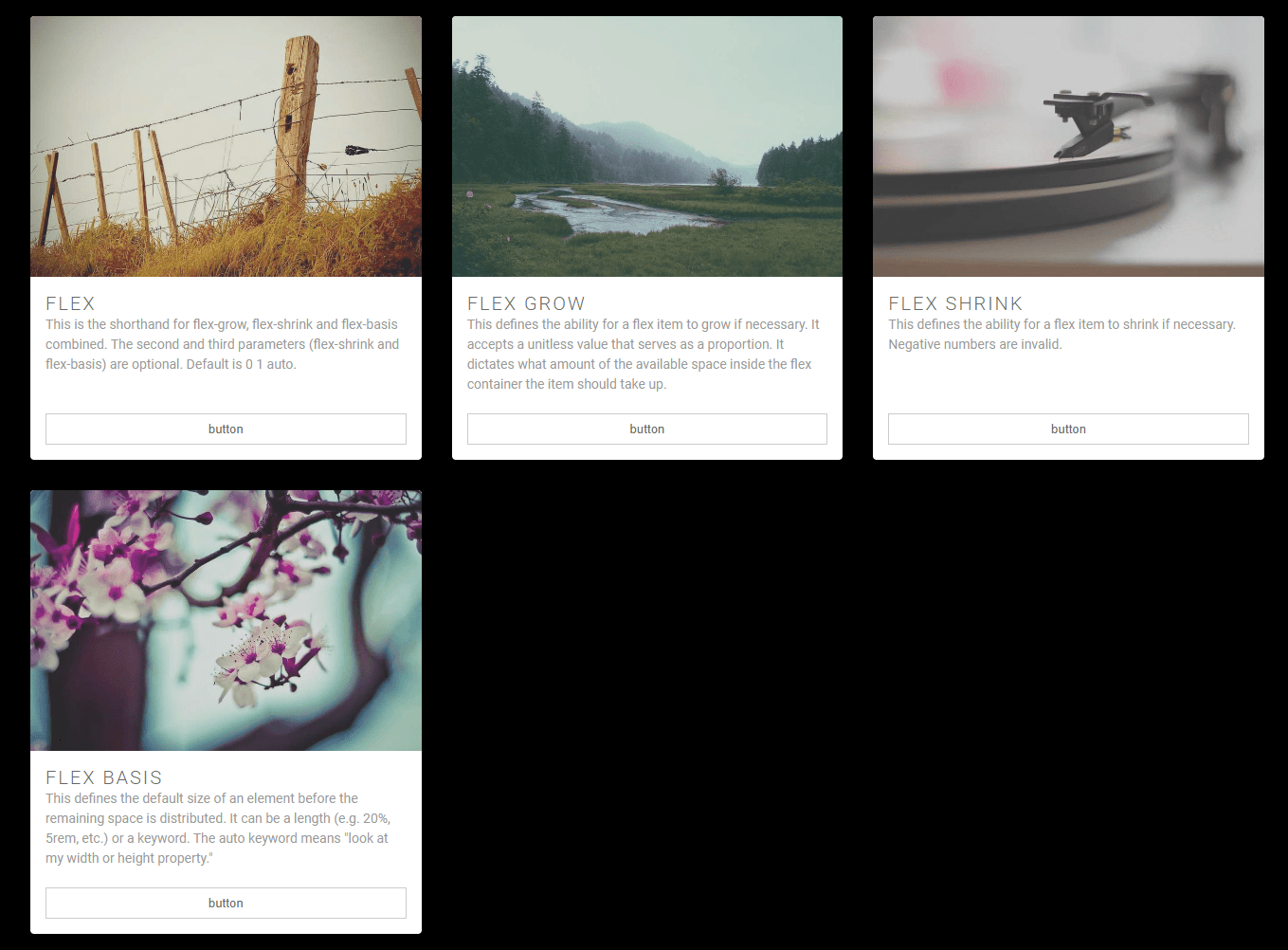
When we decrease the available width Anthony's cards are responsive:
To achieve responsiveness media queries are used:
.cards__item {
  display: flex;
  padding: 1rem;
}

@media (min-width: 40rem) { // MEDIA QUERY
  .cards__item {
    width: 50%;
  }
}

@media (min-width: 56rem) { // MEDIA QUERY
  .cards__item {
    width: 33.3333%;
  }
}
Now let's say that we are asked to include a sidebar in the design and add one of the cards to it. Easy! Let's just drop one of the cards into the sidebar.
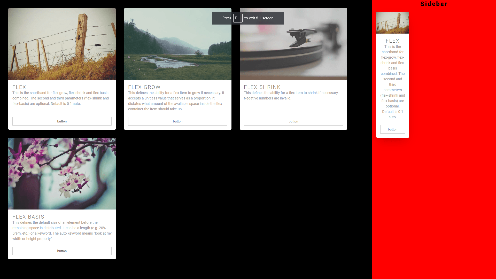
What seems to be the problem, officer? Were the cards not supposed to be responsive?
The problem is that media queries only work on the entire viewport and, in this case were written only for the main container, not the sidebar. To solve this problem we could add an extra class to the sidebar card and write media queries specific to that card. Not great! It means extra syntax, extra CSS, and therefore extra complexity.
This issue can be solved much more elegantly using the all new container queries. With container queries, you can use any element on the page as a container. So let's make the main element, as well as the sidebar a container:
main, .sidebar {
  container-type: inline-size;
}
With main and sidebar being containers now, we can simply change our media queries to container queries:
main, .sidebar {
  container-type: inline-size;
}

@container (min-width: 40rem) { // before @media
  .cards__item {
    width: 50%;
  }
}

@container (min-width: 56rem) { // before @media
  .cards__item {
    width: 33.3333%;
  }
}
Et voilà!
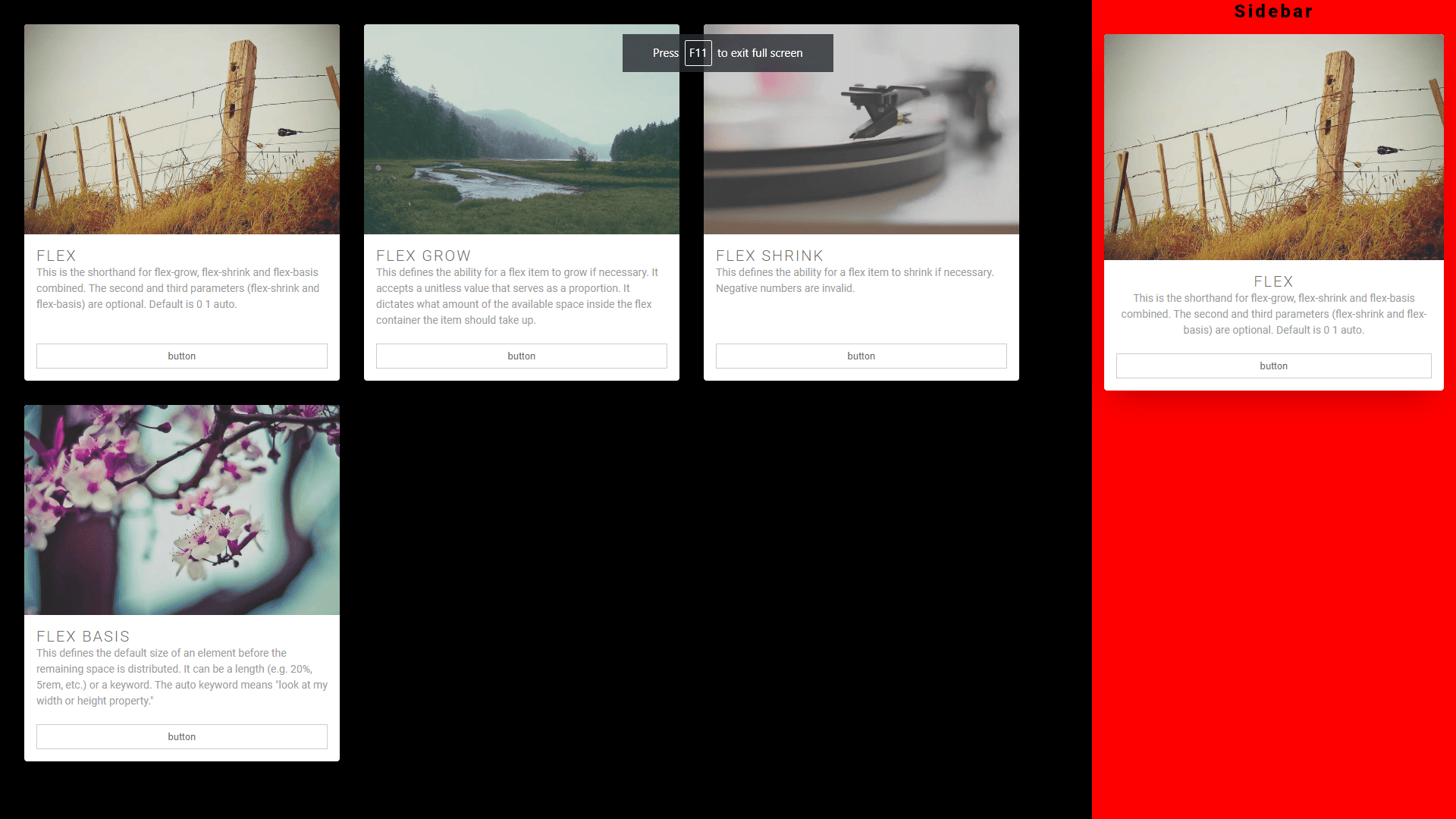
And the entire layout remains responsive:
At the time of this writing container queries are supported by all major browsers. So there is nothing holding you back from using them right now!!